Allow Empty Space
PUBLISHED
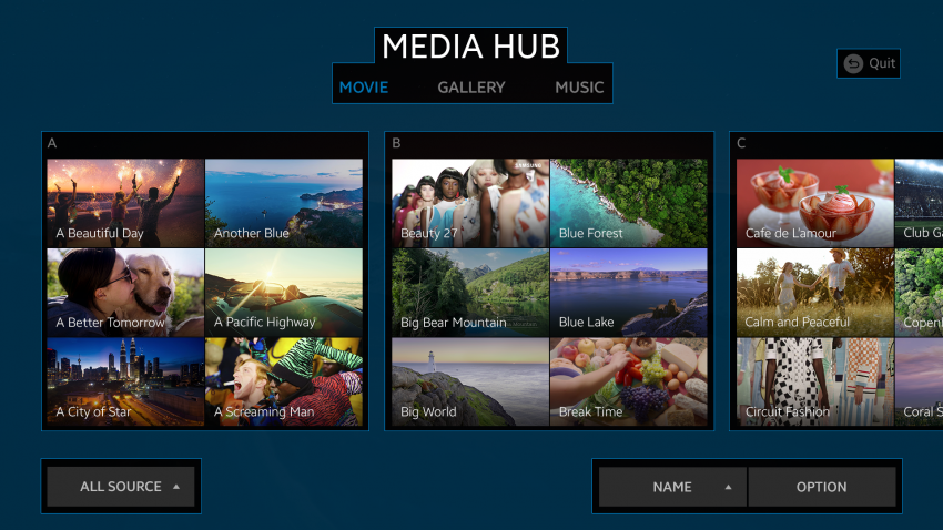
A right amount of empty space between different pieces of information makes the UI both easier to understand and more pleasing to look at. Do not think that precious screen space is wasted. Properly used empty space is a proven technique for better screen design.
Leave breathing room between the elements.

