Tizen Advanced UI Framework Guide for Mobile - Part 1
PUBLISHED
Introduction
The Tizen Advanced UI Framework allows creating and managing various kinds of UI components. These components represent a visual UI element, such as a button or slider, which provides interaction and manipulation features.
In this tip & tech document, a detailed description is given as per TAU components. Example is given with the demo for each control. This Article is divided into several parts. On this 1st part, basics of TAU and environment setup is discussed.
To work with TAU, CSS and HTML knowledge is required.
Test Settings:
|
Type |
Tizen Web App |
|
SDK |
Tizen SDK 2.4 |
|
Tested on |
Mobile Emulator and Samsung Z1 |
Advantage of TAU
- TAU is a standalone library, so no additional libraries are needed.
- Applications can be built to dramatically improve startup performance.
- TAU has a large and open API, TAU methods and core functions (event utility functions) are available and not hidden.
- TAU is customizable and easy to extend (to create new UI components).
Prerequisite
Need to add the TAU library in the project and define in index.html file.
<link rel="stylesheet" href="./lib/tau/mobile/theme/default/tau.css">
<script type="text/javascript" src="./lib/tau/mobile/js/tau.js"></script>
UI Components
UI components can be divided into four basic types.
- Presentation Views
- User Input Components
- Navigation Elements
- Assist Views
In this document, a brief description of Presentation Views is discussed.
Presentation Views
a. List View
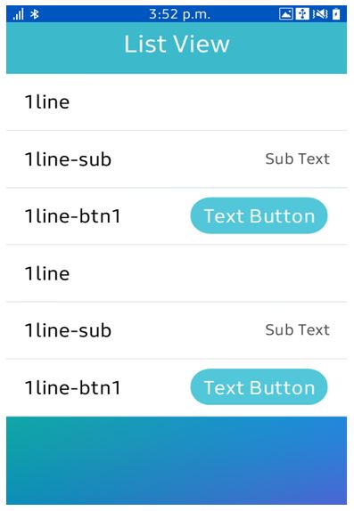
The list view component is used to display, for example, navigation data, results, and data entries, in a list format.
The code for basic ListView:
   <ul class="ui-listview">
	<li class="ui-li-static">
		1line
	</li>
	<li class="ui-li-static">
		1line-sub
		<span class="li-text-sub">Sub Text</span>
	</li>
	<li class="ui-li-static li-has-right-btn">
		1line-btn1
		<button data-inline="true">Text Button</button>
	</li>
	.
	.
	.
</ul>
b. Selectable List
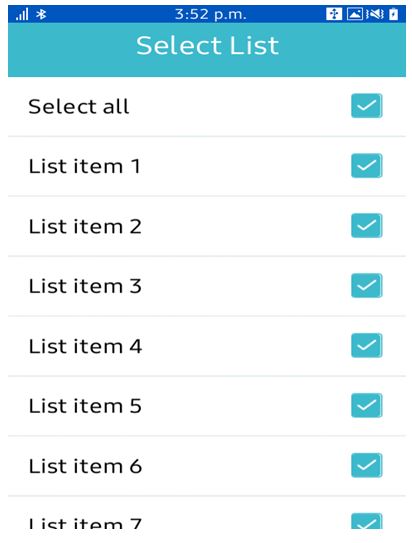
Selectable list is modification of default list view. User can select any item or select all. Checkbox can be used in each item of list.
The code for Selectable ListView:
<ul class="ui-listview" id="select-list">
            <li class="ui-li-static li-select-all li-check-all">
                <label>
                    Select all
                    <input type="checkbox" id="select-all" />
                </label>
            </li>
            <li class="ui-li-static li-select-all">
                <label>
                    List item 1
                    <input type="checkbox" id="check1" />
                </label>
            </li>
	   <li class="ui-li-static li-select-all">
                <label>
                    List item 2
                    <input type="checkbox" id="check2" />
                </label>
            </li>
	.
	.
	.
        </ul>
The js code to build the condition of selection:
function selectAll() {
  //isll contains the current value of Select All checkbox
  var i, len;
  for(i=0,len=checkboxes.length;i<len;i++) {
   checkboxes[i].checked = !isAll;
  }
  isAll = !isAll;
 }
c. Expandable List
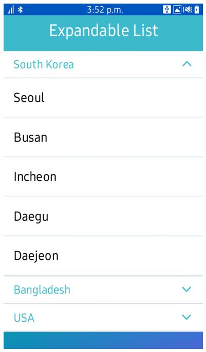
The expandable list shows a parent list view where the list items expand into child lists.
<ul class="ui-listview">
	<li class="ui-expandable">
		<h2>South Korea</h2>
		<ul class="ui-listview">
			<li class="ui-li-static">Seoul</li>
			<li class="ui-li-static">Busan</li>
			<li class="ui-li-static">Incheon</li>
			<li class="ui-li-static">Daegu</li>
			<li class="ui-li-static">Daejeon</li>
		</ul>
	</li>
	<li class="ui-expandable">
		<h2>Bangladesh</h2>
		<ul class="ui-listview">
			<li class="ui-li-static">Dhaka</li>
			<li class="ui-li-static">Chittagong</li>
			<li class="ui-li-static">Sylhet</li>
			<li class="ui-li-static">Comilla</li>
			<li class="ui-li-static">Rajshahi</li>
			<li class="ui-li-static">Khulna</li>
			<li class="ui-li-static">Barishal</li>
		</ul>
	</li>
	<li class="ui-expandable">
		<h2>USA</h2>
		<ul class="ui-listview">
			<li class="ui-li-static">New York</li>
			<li class="ui-li-static">Chicago</li>
			<li class="ui-li-static">Los Angeles</li>
			<li class="ui-li-static">Boston</li>
			<li class="ui-li-static">Nashville</li>
		</ul>
	</li>
</ul>
d. Grid View
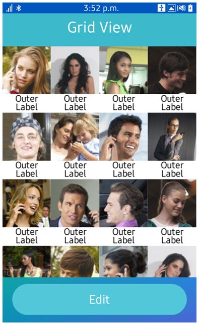
Grid View components provide a list of grid-type items and present contents that is easily identified as images. The number of columns of grid can be adjusted using a pinch gesture. In reorder mode, each item can be moved. Grid view can have labels and the type of labels can be set. Grid View is needed for showing bulk data like Gallery application.
Images are required to be added to ‘images’ folder.
<ul id="gridview" class="ui-gridview" data-label="out">
	<li class="ui-gridview-item">
		<img class="ui-gridview-image" src="images/1.jpg">
		<p class="ui-gridview-label">Outer Label</p>
		<div class="ui-gridview-handler"></div>
	</li>
	<li class="ui-gridview-item">
		<img class="ui-gridview-image" src="images/2.jpg">
		<p class="ui-gridview-label">Outer Label</p>
		<div class="ui-gridview-handler"></div>
	</li>
	<li class="ui-gridview-item">
		<img class="ui-gridview-image" src="images/3.jpg">
		<p class="ui-gridview-label">Outer Label</p>
		<div class="ui-gridview-handler"></div>
	</li>
	.
	.
	.
</ul>
e. Progress
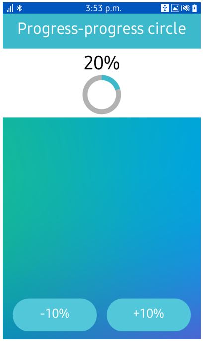
If a specific task is running continually over a certain period of time, an offer can be made to users for a visual cue about its progress or process.
Here ‘+10%’ is used to increase the progress bar by 10% and ‘-10%’ is used to decrease the progress bar by 10% to show how the progress bar actually works.
<div class="ui-content">
	<div class="progress-bg">
		<div class="result" id="result"></div>
		<div data-type="circle" data-size="large" data-value="20" class="ui-progress" id="circle"></div>
	</div>
</div><!-- /content -->
<div class="ui-footer" data-position="fixed">
	<a id="minus" href="#" class="ui-btn">-10%</a>
	<a id="plus" href="#" class="ui-btn">+10%</a>
</div>
And JS code for condition (See example app for full implementation)
pageBeforeShowHandler = function () {
	progressBarWidget = new tau.widget.Progress(progressBar);
	minusBtn.addEventListener("click", minusBtnClickHandler);
	plusBtn.addEventListener("click", plusBtnClickHandler);
	i = parseInt(progressBarWidget.value(), 10);
	resultDiv.innerHTML = i + "%";
};
Running the sample application:
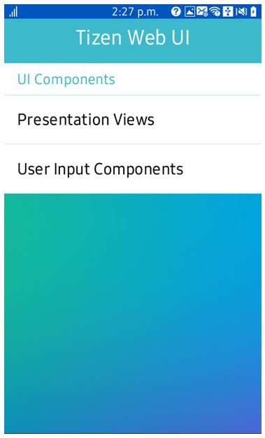
Figure 1: Main Menu
References:
[1] https://developer.tizen.org/dev-guide/2.4/org.tizen.ui.practices/html/web/tau/guides_tau_w.htm
